
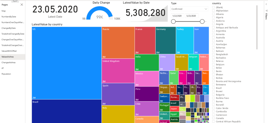
A picture speaks a thousand words.
In times of Corona and the incessant media coverage of the subject, I thought it might be interesting to analyse the data myself. I used the data provided by John Hopkins university to create the chart above and a few others. Globally speaking, the pandemic is far from over but the measures applied by many countries changed the spread from exponential to almost linear. In general, countries experience an exponential start followed by a slow recess of infected population. This creates a typical hump-shaped chart.
The tools I used to produce the analysis are git, SSIS, SQL Server and Power BI.
The usual complication with data processing also occurred in this tiny project: Changes in source data structures, semantic changes of fields, incomplete and inconsistent data as well as differing levels of detail. Furthermore, looking at the charts, it is obvious that different countries have different approaches to the epidemic itself, as well as to their reporting strategies.