
Data Analysis
2020-06-09
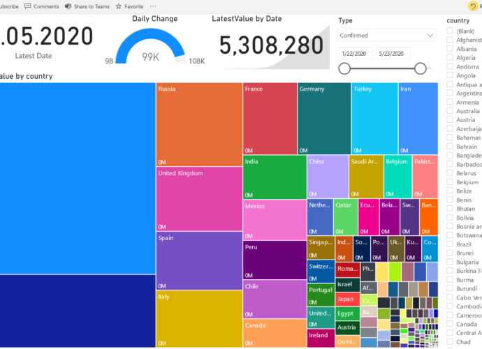
A picture speaks a thousand words. In times of Corona and the incessant media coverage of the subject, I thought it might be interesting to analyse the data myself. I used the data provided by John Hopkins university to create the chart above and a few others. Globally speaking, theRead More →