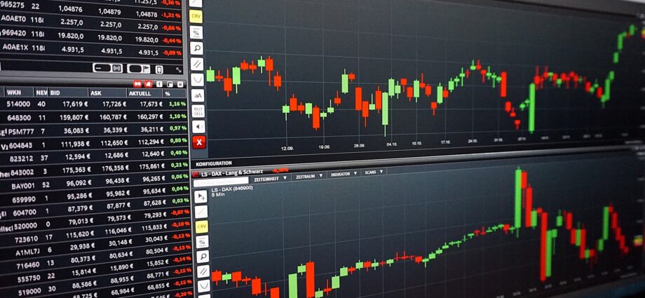
A picture paints a thousand words!
For many people this proverb holds true. Be it bars, lines, 3D graphs, bubble charts or any other type of visualisation, they convey a message from the displayed data at a single glance. What individual form of display is used depends on the information to be shown, the intended effects of showing it and, of course, also personal preferences.
Often the recognition factor is a motive in creating visual reports, and a value in its own right. Because if a graph’s format is kept static and shown over and over again, readers can assess the situation it depicts within fractions of a second.
There are many powerful tools on the market to create such charts, everyone of them having its own strengths and weaknesses. Hence, the right choice is important for creating good looking and also meaningful results.
As a technician, I mostly prefer graphs over the “Excel tapestry”. If you too are of this nature and need help to get what you want, contact me.

