
Got Numbers?
2023-05-30
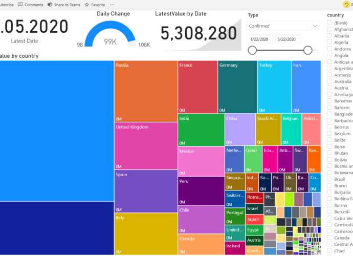
I bet you have plenty! However, are they the ones you need? Are they the ones that you are interested in? Are they being produced automatically? Do you have them available any time you want them? In case you have questions about a particular number, can you get the answersRead More →